Bootstrap Alert Box: With these alerts one can send easy notifications to the user about the proceedings and make things get right attention from user point of view. These alert notification and messages conveys right action to the user about the information. Green box is one default view how the bootstrap alert message shows.
To start with bootstrap alert you need add specific class .alert class and then you can give them specific color as per the requirements. Check out its simple layout for start using with Bootstrap Alerts now and test more with our live try it editor!
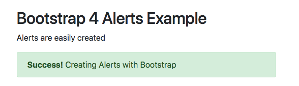
 <p>Default view of the bootstrap Alert </p>
  <div class="alert alert-success">
    <strong>Success!</strong> Creating Alerts with Bootstrap
</div> In latest version this is the CSS being implemented for bootstrap alerts with specific values for heading link and dismissible respectively. With every specific color their are values associated with its hr and link which are defined separately as mentioned below. Lets have a quick look at Bootstrap Alert CSS.
alert{
position:relative;
padding:.75rem 1.25rem;
margin-bottom:1rem;
border:1px solid transparent;
border-radius:.25rem}

.alert-heading{color:inherit}
.alert-link{font-weight:700}

.alert-dismissible{padding-right:4rem}
.alert-dismissible .close{position:absolute;top:0;right:0;padding:.75rem 1.25rem;color:inherit}

.alert-primary{color:#004085;background-color:#cce5ff;border-color:#b8daff}
.alert-primary hr{border-top-color:#9fcdff}
.alert-primary .alert-link{color:#002752}

.alert-secondary{color:#383d41;background-color:#e2e3e5;border-color:#d6d8db}
.alert-secondary hr{border-top-color:#c8cbcf}
.alert-secondary .alert-link{color:#202326}

.alert-success{color:#155724;background-color:#d4edda;border-color:#c3e6cb}
.alert-success hr{border-top-color:#b1dfbb}
.alert-success .alert-link{color:#0b2e13}
.alert-info{color:#0c5460;background-color:#d1ecf1;border-color:#bee5eb}
.alert-info hr{border-top-color:#abdde5}
.alert-info .alert-link{color:#062c33}

.alert-warning{color:#856404;background-color:#fff3cd;border-color:#ffeeba}
.alert-warning hr{border-top-color:#ffe8a1}
.alert-warning .alert-link{color:#533f03}

.alert-danger{color:#721c24;background-color:#f8d7da;border-color:#f5c6cb}
.alert-danger hr{border-top-color:#f1b0b7}
.alert-danger .alert-link{color:#491217}

.alert-light{color:#818182;background-color:#fefefe;border-color:#fdfdfe}
.alert-light hr{border-top-color:#ececf6}
.alert-light .alert-link{color:#686868}

.alert-dark{color:#1b1e21;background-color:#d6d8d9;border-color:#c6c8ca}
.alert-dark hr{border-top-color:#b9bbbe}
.alert-dark .alert-link{color:#040505} You can add all contextual classes for getting the right view from user perspective easily with their specific utility classes. You can use them with links or separately to draw the user attention. These following classes are available for use with .alert-success, .alert-info, .alert-warning, .alert-danger, .alert-primary, .alert-secondary, .alert-light & .alert-dark accordingly.
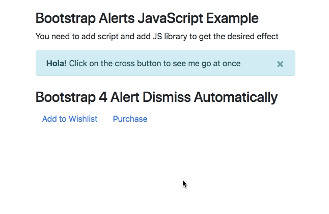
With JavaScript you can make sure these alerts work on events and then give proper working as per their event required.
Bootstrap 4 Alert Dismiss:This can be achieved by adding the right classes as given in default and impart dismiss behaviour to the design.
Bootstrap 4 Alert Dismiss Automatically:
To do this automatically you need to further add JavaScript code that will close the the Bootstrap 4 Alert Dismiss Automatically. Check out the code below for bootstrap alert auto close example with all the values.
These alerts can be given comprehensive design with colors, attributes and more can done by adding custom JavaScript that check their behaviour to the user respectively. Here we are going to study the Bootstrap 4 Alert Styles with Alert on button click, Bootstrap Alert with Icon, bootstrap alert dismiss automatically, Bootstrap Alert Modal and template that offers wide range of use, color, Height, show, fade and practical use in general.
Bootstrap Alert height is defined by values of padding, hence changing the values will make the height low or high from its default value. All values are used in rem only and must be used as per latest changes in Bootstrap 4.
For adding Icons to the Bootstrap 4, you need to add specific CDN and respective classes to get the desired affects. Here is quick check how you can add Font Awesome in Bootstrap 4 Alerts with CDN and icon class.
<head>
<link rel="stylesheet" href="https://cdnjs.cloudflare.com/ajax/libs/font-awesome/4.7.0/css/font-awesome.min.css">
</head>

<i class="fa fa-info-circle"></i>
Modals are popup and are used in Bootstrap as separate component. You can easily combine them with bootstrap alerts to give a systematic design view. Here is a quick example for that.
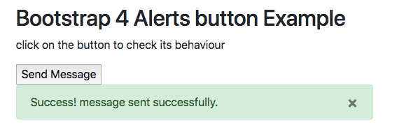
For using Bootstrap alert with button click you need to first hide the alert box and then call the alert box on call at button call with the use of click button JavaScript. Here is a quick example for that example with JavaScript too.
Bootstrap Alert Box on Button Click
Check out a full fledge page layout and check how Bootstrap Alerts can be used with in a Template with simple JavaScript use with animation all around.
Here is the comprehensive list for all classes being used with Alerts
[table class=”table-bordered bootstrap-table” caption=”Bootstrap Alert Classes” width=”” colwidth=”” colalign=”” border=”1″]
Class name,Description,Example
.alert, This Specific class will create the whole important Alert Notification, Try it Editor
.alert-primary, Adds special blue alert to the prompt alert requiring user action, Try it Editor
.alert-secondary, This specific class adds grey color to the alert content, Try it Editor
.alert-success, Green box alert offering a success in the action like form submission, Try it Editor
.alert-info, Indicates a teal color alert showing neutral changes in action, Try it Editor
.alert-warning, Caution yellow alert for threatened action ,Try it Editor
.alert-danger, Indicates dangerous red alert implying negative action,Try it Editor
.alert-light, Light Grey alert box for light affect of the whole action,Try it Editor
.alert-dark, Dark Grey alert box for dark affect of the whole action,Try it Editor
.alert-link, Given to Links inside alert box for color matching inside it,Try it Editor
.alert-dismissible, Closable alert box with special close class for desired affect,Try it Editor
.alert-heading, This Specific class adds color:inherit to the whole alert heading,Try it Editor
.close, This Class styles the close button on top right alert box with font size and color,Try it Editor
[/table]
App usage is growing steadily without showing any signs of slowing down. Hence, it is no surprise that mobile applications…
As the world has grown more digital, businesses have adapted themselves. An effectual adaptation includes online advertising. Offline advertising styles…
Step into a world where apps dance to the user's tune. Picture Instagram, a photo-sharing sensation that swept the globe.…
COVID-19 has led to a digitalization of lifestyle. As patients are taking their mental and physical health more seriously, healthcare…
Introduction WordPress, an immensely popular content management system (CMS), powers over 40% of the internet. What makes WordPress even more…
For moving companies trying to capture their market share amidst stiff competition, a tip or two about what they can…